
Operating System
Transforming dry financial numbers into compelling visual stories can make data more engaging and easier to understand. These 10 creative presentation methods leverage modern tools and design principles to turn complex financial data into clear, actionable insights for any audience.
Interactive Dashboard with Real-Time Updates
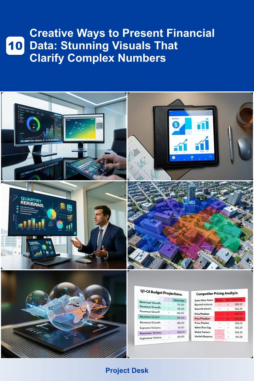
Executives drowning in spreadsheets will love interactive dashboards that bring financial data to life with real-time updates. Tools like Power BI and Tableau transform raw numbers into dynamic visuals—think live KPIs, drill-down filters, and auto-refreshing charts—so decisions happen faster than ever.
With drag-and-drop customization, you can highlight trends, compare quarters, or spot anomalies instantly. The real magic is the zero-config data connections to SQL databases, Excel, or cloud services like Google Analytics. Need to adjust filters mid-presentation? No problem—just tap or click. These dashboards even work on mobile, so leaders stay informed from anywhere.
This is the go-to solution for CFOs, investors, or sales teams who need to monitor performance without digging through reports. Perfect for board meetings or daily standups where every second counts. ⚡
Infographic Storytelling with Data Visualization
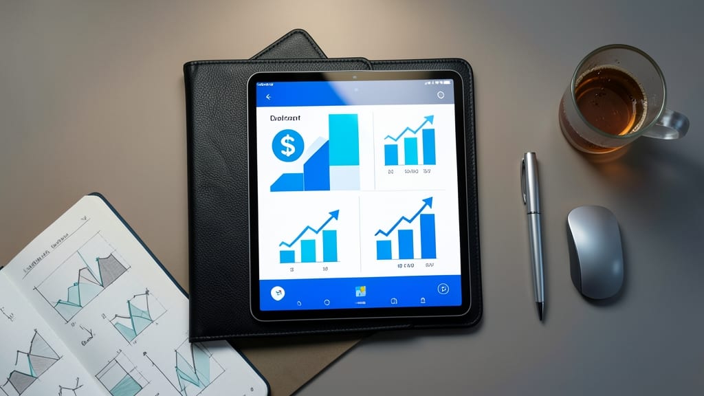
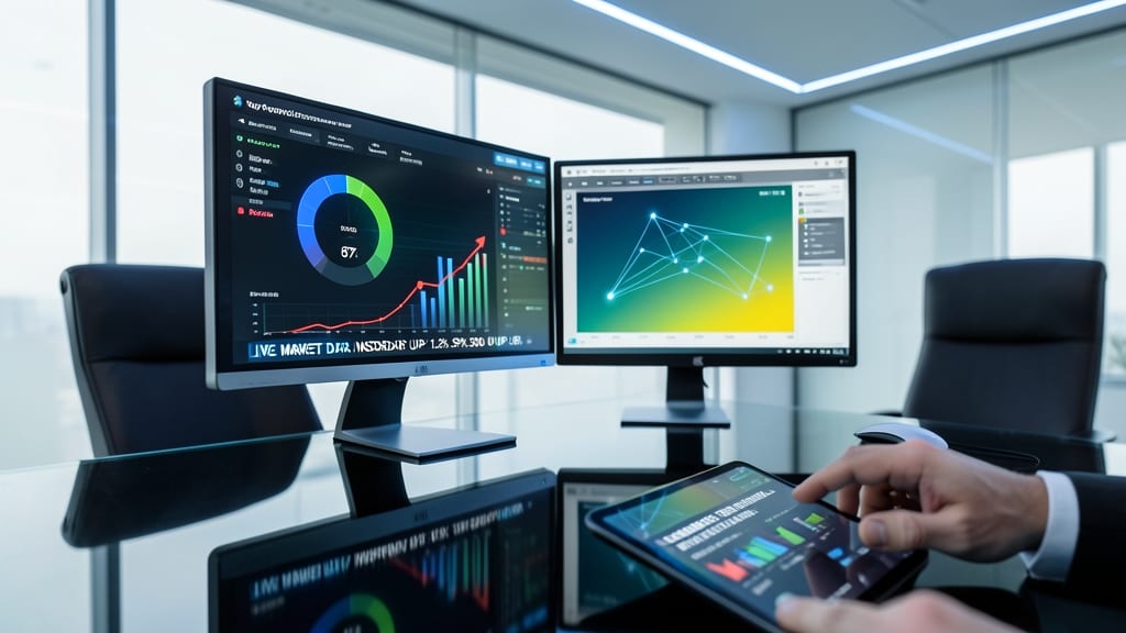
When your audience skims slides faster than they can read your financial reports, infographic storytelling turns numbers into a visual narrative that sticks. Tools like Canva or Piktochart let you combine icons, charts, and minimal text into a single, digestible frame—perfect for marketing teams or boardroom presentations where clarity trumps detail.
The secret lies in hierarchy: use bold typography for key metrics, color-coded trends to highlight growth, and icons (like dollar signs or upward arrows) to reinforce messages instantly. For example, a quarterly revenue infographic might show a bar chart of sales alongside a timeline of milestones—all in one glance. Templates in these tools often include finance-specific designs, so you’re not starting from scratch.
This approach shines when you’re pitching to non-technical stakeholders who need to grasp insights quickly. Skip the jargon—let the visuals do the talking. ✨
Animated Explainer Videos for Financial Trends
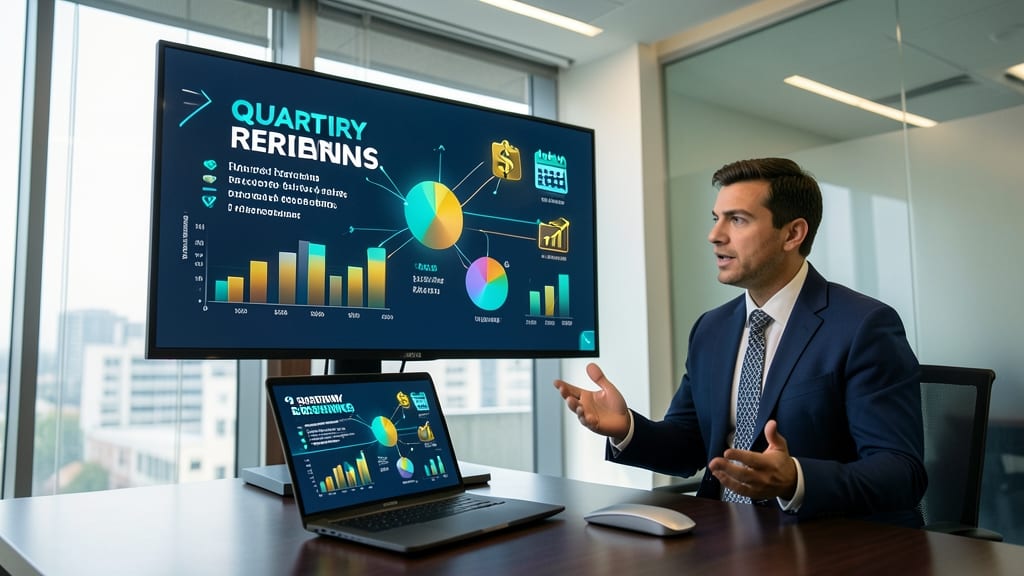
Struggling to explain quarterly earnings or budget forecasts without losing your audience? Animated explainer videos turn abstract financial data into engaging motion graphics that stick in viewers' minds—ideal for onboarding new hires or walking clients through complex concepts.
Tools like Vyond or Animaker let you create professional-grade videos with customizable templates, smooth transitions, and voiceover narration to guide viewers through trends. For example, a 30-second animated chart showing revenue growth over time is far more memorable than a static PowerPoint slide. You can even embed real-time data feeds for dynamic updates.
Perfect for HR teams, financial advisors, or startup founders pitching to investors—these videos make dry data feel intuitive and interactive. ✨
Geospatial Heatmaps for Regional Financial Data

Forget spreadsheets when location matters—geospatial heatmaps transform raw financial data into intuitive, color-coded maps that reveal regional opportunities and risks at a glance. Unlike traditional charts, these visualizations pinpoint high-performing areas (like property values or sales revenue) by overlaying data onto actual geography, making patterns instantly clear.
Tools like Tableau’s geospatial mapping or Google Earth Studio let you customize heatmap intensity (from cool blues to fiery reds) based on metrics like ROI or transaction volume. The result? A single-view snapshot that highlights clusters of success—or red flags—without sifting through rows of numbers. Drill down to neighborhoods or zoom out to entire states, all while keeping the data dynamic.
This method is a game-changer for real estate agents spotting undervalued markets or sales teams identifying hotspots for expansion. Just upload your dataset, assign a color scale, and watch insights emerge. ✨
3D Financial Models for Investment Analysis

Tired of flat charts that fail to capture the depth of your investment strategy? 3D financial models let you interact with portfolio allocations, risk layers, and asset distributions in real time—like spinning a globe to reveal hidden insights.
Tools like Microsoft Power BI 3D charts, Tableau’s spatial visualizations, or Blender for custom financial modeling let you map asset correlations, geographic risk distributions, or multi-year projections in a single interactive space. Rotate to compare sectors, zoom into high-risk areas, and even overlay real-world data like market trends—all while keeping the original data intact. The tactile experience helps stakeholders grasp complex relationships that 2D charts obscure.
Perfect for private equity firms, hedge funds, or corporate strategy teams, these models shine when you need to explain layered financial concepts—like how a single acquisition impacts cash flow across three years. For analysts who thrive on spatial reasoning, this is the ultimate way to turn numbers into a tactile story. ✨
Comparative Side-by-Side Data Tables

When comparing quarterly budgets or competitor pricing, side-by-side data tables become your secret weapon. Unlike standalone charts, these tables let you compare metrics like revenue, expenses, or market share directly, with built-in visual cues that highlight discrepancies instantly.
Tools like Excel’s Conditional Formatting or Google Sheets’ Compare Columns let you apply color scales (e.g., green for gains, red for losses) and data bars to show trends at a glance. For deeper analysis, Power Query merges datasets automatically, while plugins like Tableau’s Side-by-Side Views add interactive drill-downs. The result? A single-screen overview that replaces hours of manual cross-referencing.
This method shines for auditors, procurement teams, or startups benchmarking against competitors. Just add a highlighted delta column to show percentage differences, and even non-technical stakeholders grasp insights faster. ✨
Financial Data Sculptures with 3D Printing

Turn heads at your next trade show or board meeting with 3D-printed financial sculptures—where data takes a physical form. Unlike flat charts or digital models, these tactile creations let stakeholders touch and explore financial trends as sculptural art, making abstract numbers feel real and immediate.
Tools like Tinkercad (for beginners) or Blender (for advanced customization) let you convert datasets into scalable 3D shapes—think spiraling stock trends as metallic curves or budget allocations as layered geometric blocks. Print with PLA or resin for durability, and add color gradients to highlight growth, decline, or key metrics. The result? A conversation starter that lingers in attendees' minds long after the presentation ends.
This approach shines for executives who want to impress or startups pitching investors—anyone who needs to leave a lasting impression beyond PowerPoint slides. 🌟
Time-Lapse Financial Progress Videos
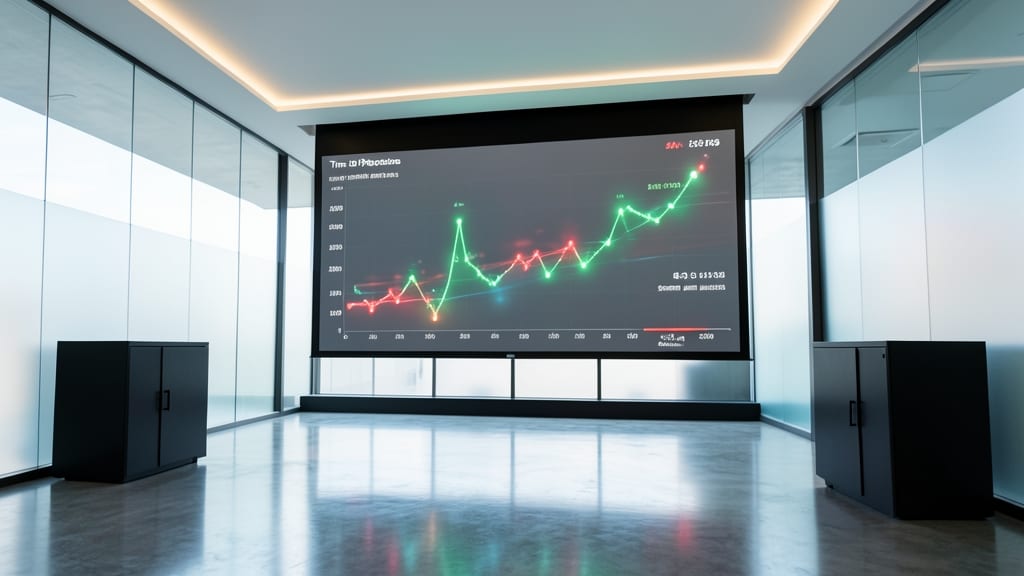
Turn years of financial data into a gripping story with time-lapse progress videos—the perfect tool for annual reports or long-term project reviews. Instead of static charts, these videos show growth (or decline) over time with smooth animations that highlight key milestones.
Tools like Adobe After Effects or Canva’s animation features let you sync data points with visual transitions, while PowerPoint’s Morph feature offers a simpler, no-frills option. Add voiceovers or subtitles to explain trends, and you’ve got a presentation that sticks in your audience’s mind. The result? A cinematic way to showcase financial journeys that feels dynamic and professional. ✨
Custom Financial Data Art with Algorithmic Design

Turn financial reports into conversation starters with algorithmic data art—where spreadsheets meet modern art. Tools like Processing or p5.js transform raw numbers into generative patterns, turning budgets or stock trends into abstract visuals that still convey insights at a glance.
Start by feeding your dataset into a custom algorithm that maps values to colors, shapes, or motion. For example, Python libraries like Matplotlib or D3.js let you create dynamic visuals where fluctuations in revenue become flowing gradients or geometric fractals. The result? A piece that hangs in your office and tells a story—no static charts required.
Perfect for agencies pitching to creative clients or startups wanting to stand out at investor meetings. Your data doesn’t just inform—it inspires. ✨
Interactive Whiteboard Presentations with Touch Technology
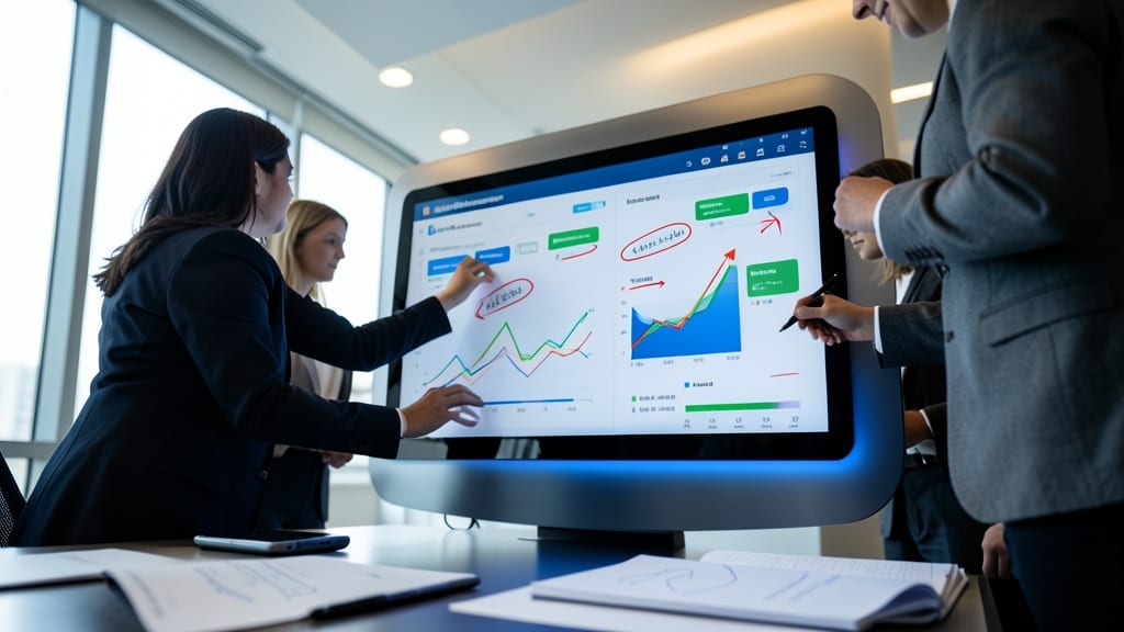
Ditch the static slides—when your team needs to debate budgets or spot trends together, a touch-enabled whiteboard turns passive viewers into active collaborators. Tools like Microsoft Surface Hub or Smart Technologies boards let you drag-and-drop financial charts, annotate live data, and even save sessions to cloud storage for later review.
The best models support multi-touch input (up to 40 points) and 4K resolution, so every pixel stays crisp during high-stakes discussions. Pair that with integrated cameras for hybrid meetings, and suddenly, remote team members can join the whiteboard action too. No more awkward pauses—just seamless, real-time collaboration that keeps everyone aligned. 💡
This is the go-to for finance teams running workshops or startups pitching investors—where ideas evolve faster than slides can flip. Perfect for when your data deserves to be touched, tested, and transformed on the spot.